- Fix regression from #21893 which had misaligned a few tables like repo
lists and e-mails
- Bring githooks list in line with webhooks list for styling
- Change webhook list icons to just colored dots, like githook list
- Increase size of dot in webhook and githook list from 16 to 22px
This should eliminate all non-variable color usage in the styles, making
gitea fully themeable via CSS variables. Also, it adds a linter to
enforce variables for colors.
Move the text color rules out of the unneeded `.ui` block, add missing
colors, tweak colors on arc-green to be more readable (red was
particulary bad to read).
Also, this removes the previous inheritance of link colors. I think
links should always be in primary color and if they are to be
discolored, the color should be set on them explicitely.
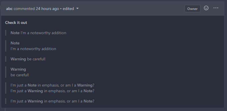
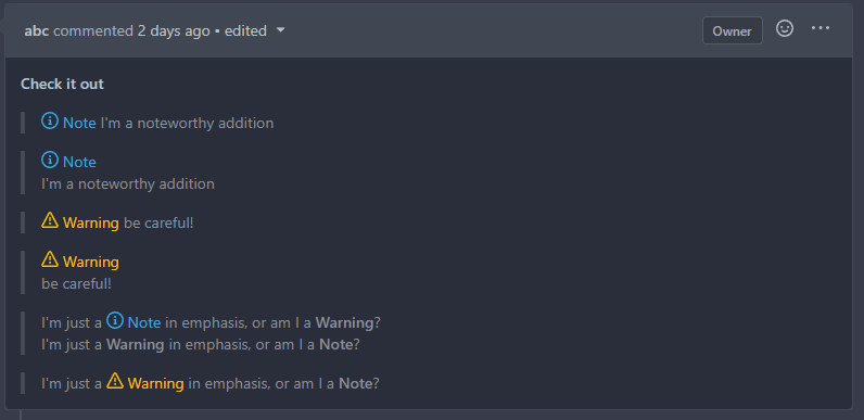
<img width="165" alt="Screenshot 2022-11-12 at 13 28 30"
src="https://user-images.githubusercontent.com/115237/201474098-700d9fed-3133-43c7-b57e-d4cc5c2795cb.png">
<img width="152" alt="Screenshot 2022-11-12 at 13 18 48"
src="https://user-images.githubusercontent.com/115237/201474156-b6de4cb5-bce8-4553-b3d4-8365aff9a3a7.png">
HTML to test with:
```html
<div class="text red">some text with <a href="#foo">a link</a>.</div>
<div class="text orange">some text with <a href="#foo">a link</a>.</div>
<div class="text yellow">some text with <a href="#foo">a link</a>.</div>
<div class="text olive">some text with <a href="#foo">a link</a>.</div>
<div class="text green">some text with <a href="#foo">a link</a>.</div>
<div class="text teal">some text with <a href="#foo">a link</a>.</div>
<div class="text blue">some text with <a href="#foo">a link</a>.</div>
<div class="text violet">some text with <a href="#foo">a link</a>.</div>
<div class="text purple">some text with <a href="#foo">a link</a>.</div>
<div class="text pink">some text with <a href="#foo">a link</a>.</div>
<div class="text brown">some text with <a href="#foo">a link</a>.</div>
<div class="text grey">some text with <a href="#foo">a link</a>.</div>
Browsers introduce a opaque background on iframes if the iframe
element's color-scheme does not match the document's color scheme which
in case of a dark theme results in a mismatch and the browser adds a
white background. Avoid this by specifying the same color scheme outside
and inside the iframe.

See https://fvsch.com/transparent-iframes for more info.

My initial attempt was to make the iframe document the same color-scheme
as the parent page (light or dark) but with that, there was a ugly
background flash on load in Chrome because Chrome apparently always
loads iframe in light scheme initially. Firefox still shows a background
flash on load but this is not possible to get rid of and it's certainly
a browser bug.

Before:
<img width="1147" alt="Screen Shot 2022-10-31 at 13 30 55"
src="https://user-images.githubusercontent.com/115237/199017132-9828aace-bdd0-4ede-8118-359e72bcf2fe.png">

After:
<img width="1152" alt="Screen Shot 2022-10-31 at 13 30 36"
src="https://user-images.githubusercontent.com/115237/199017137-989a9e67-3fe0-445f-a191-df5bf290dabf.png">
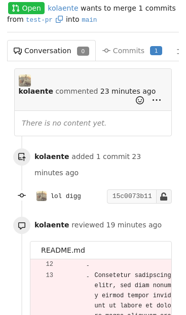
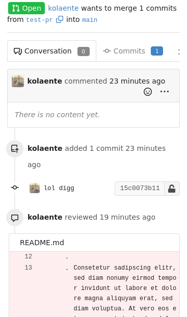
- Fix placement of avatar image, this was not placed in the
`comment-header-left` and add CSS to cover the limiting of width+height
of avatar for code-review comment on "Files changed" page. This fixes
the big noticeable avatar issue.
- Apply `margin-bottom` to the "next" button, so it's consistent with
the "previous" button.
- Make sure the "next"/"previous" start at `flex-start` on mobile and
not off-screen at `flex-end`. As well force them to have `flex: 1` so
they won't overflow on x-asis. This also requires the `width: 100%` for
the `.ui.buttons` div.
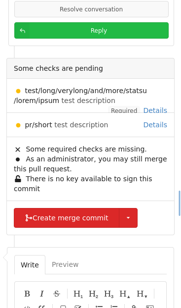
- Resolves#20074
### Before
<details><img width="512"
src="https://user-images.githubusercontent.com/25481501/195952930-09560cad-419f-43a3-a8a4-a4166c117994.jpg"></details>
### After
<details><img width="512"
src="https://user-images.githubusercontent.com/25481501/197340081-0365dfa8-4344-46b4-8702-a40c778c073f.jpg"></details>
Co-authored-by: Lunny Xiao <xiaolunwen@gmail.com>
Co-authored-by: silverwind <me@silverwind.io>
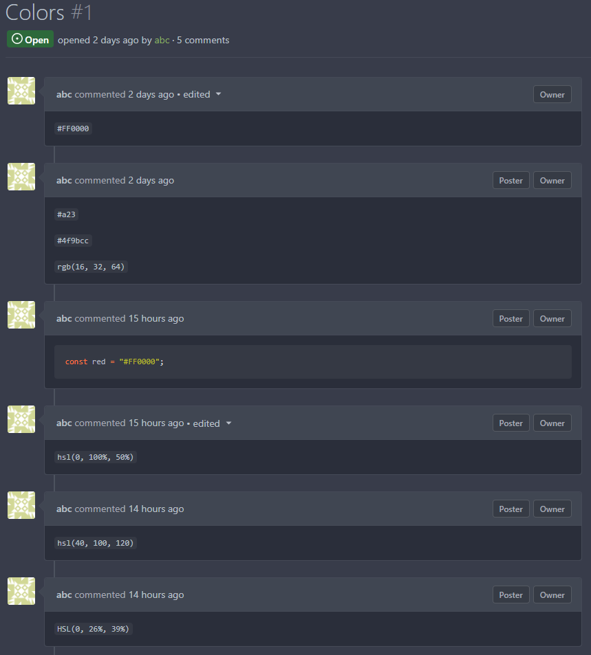
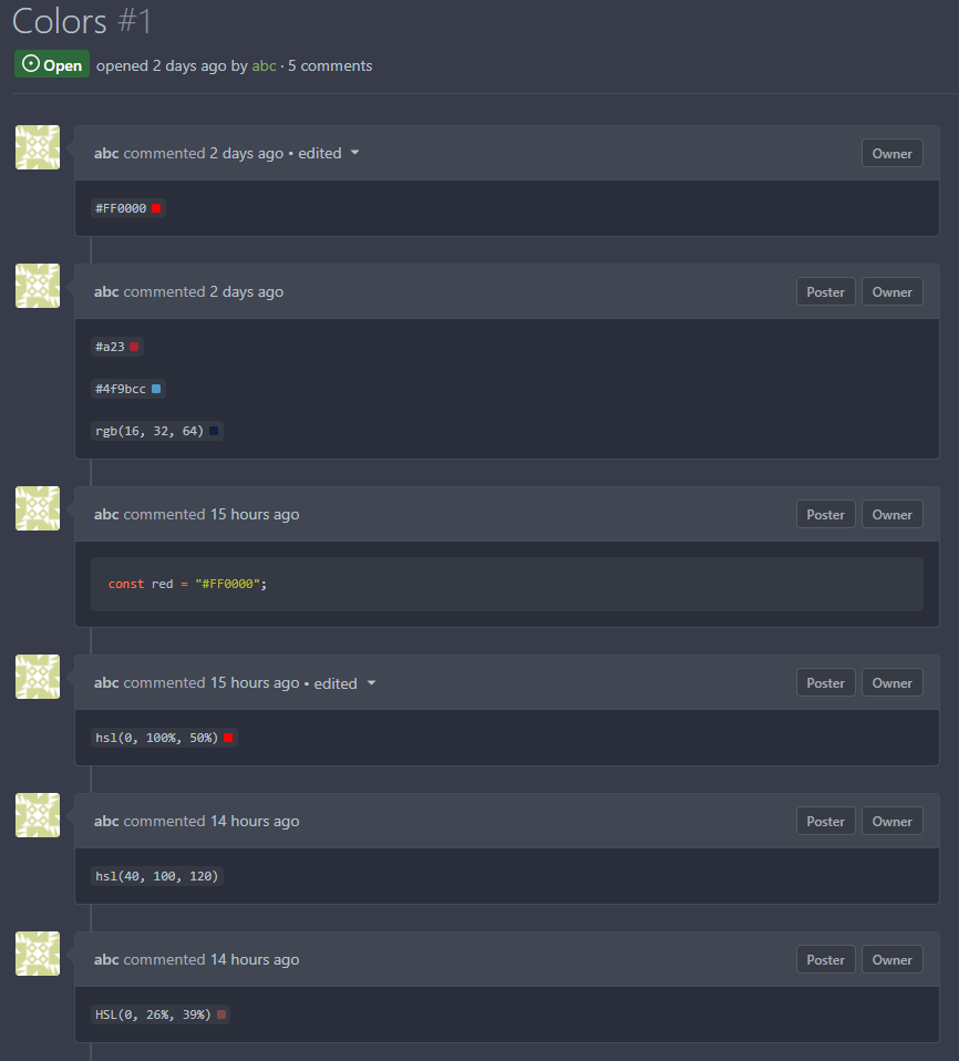
This changes the rendering logic of issue titles. If a substring in an
issue title is enclosed with a pair of backticks, it'll be rendered with
a monospace font (HTML `code` tag).
* Closes#20887
Signed-off-by: Yarden Shoham <hrsi88@gmail.com>
Co-authored-by: Gusted <williamzijl7@hotmail.com>
Co-authored-by: wxiaoguang <wxiaoguang@gmail.com>
Co-authored-by: 6543 <6543@obermui.de>
Adds the settings pages to create OAuth2 apps also to the org settings
and allows to create apps for orgs.

Refactoring: the oauth2 related templates are shared for
instance-wide/org/user, and the backend code uses `OAuth2CommonHandlers`
to share code for instance-wide/org/user.

Co-authored-by: wxiaoguang <wxiaoguang@gmail.com>
At the moment, this is only used to replace the color of the `viewed`
checkbox and of the `has changed` label.
Previously, the used variable accentuated always either darker or
lighter, which meant that one theme looked good while the other didn't.

Co-authored-by: silverwind <me@silverwind.io>
- Consolidate various CSS rules into base rules
- Fix inline code in Markdown not having enough contrast on arc-green

Adds one new color variable, `--color-label-active-bg` for the
background of active labels.

Co-authored-by: wxiaoguang <wxiaoguang@gmail.com>
This PR adds a filetree to the left side of the files/diff view.
Initially the filetree will not be shown and may be shown via a new
"Show file tree" button.
Showing and hiding is using the same icon as github. Folders are
collapsible. On small devices (max-width 991 PX) the file tree will be
hidden.
Close#18192
Co-authored-by: wxiaoguang <wxiaoguang@gmail.com>
- Remove arc-green specific rules and instead fix the colors in the base
rules.
- Make file table row border visible on arc-green.
- Remove remnants of fomantic accordeon module that was removed.
The problem was that many PR review components loaded by `Show more`
received the same ID as previous batches, which confuses browsers (when
clicked). All such occurrences should now be fixed.
Additionally improved the background of the `viewed` checkbox.
Lastly, the `go-licenses.json` was automatically updated.
Fixes#21228.
Fixes#20681.
Co-authored-by: wxiaoguang <wxiaoguang@gmail.com>
Fomantic has abrupt breakpoints at 991px and 768px which leads to
variable amounts of wasted screen space below those breakpoints.
Instead, enable fluid width for all viewport sizes below 1200px.